Objective
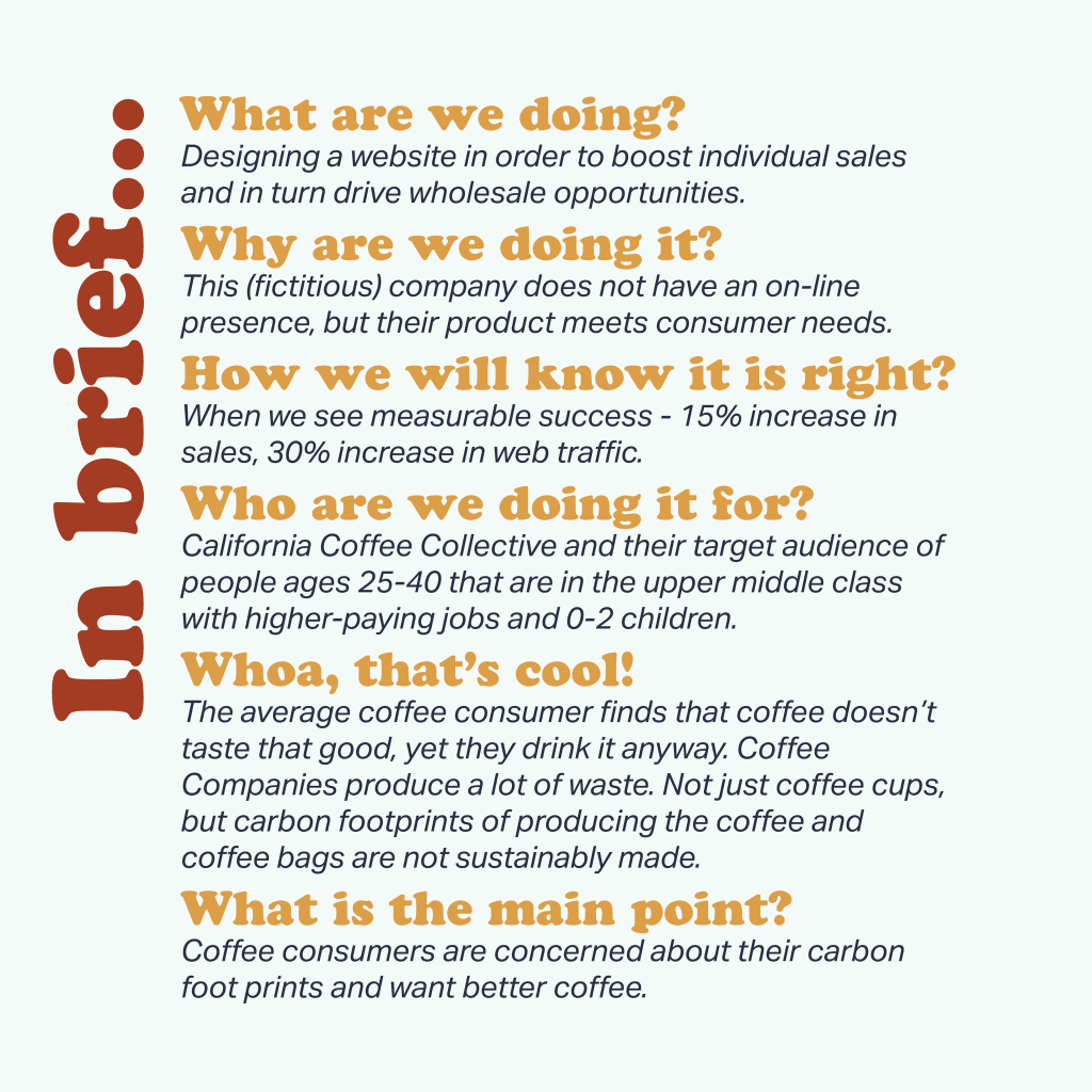
California Coffee Collective wants to persuade people ages 25-35 that that they should buy California Coffee Collective. People in this age group should not waste their time drinking bad coffee, they have lives to live and they work hard. They should be able to enjoy their coffee. The goal is to raise product awareness and increase sales. An ideal growth would be to see an increase in sales by 10% and an increase in brand awareness by 15%.


The audience
Needs Assessment
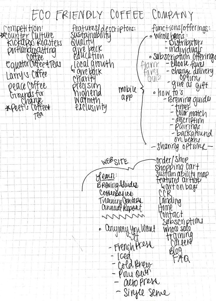
I start all web design projects out even before I meet with the client with just a basic plan. I like to call this the needs assessment. It lets me list off everything they might need on their website. It also gives me room to consider what appears on the competitions website and what appears on totally unrelated sites that might be supportive of my client’s design. I do this by hand to keep it loose and let me annotate and keep it loose.
THE WEB Map
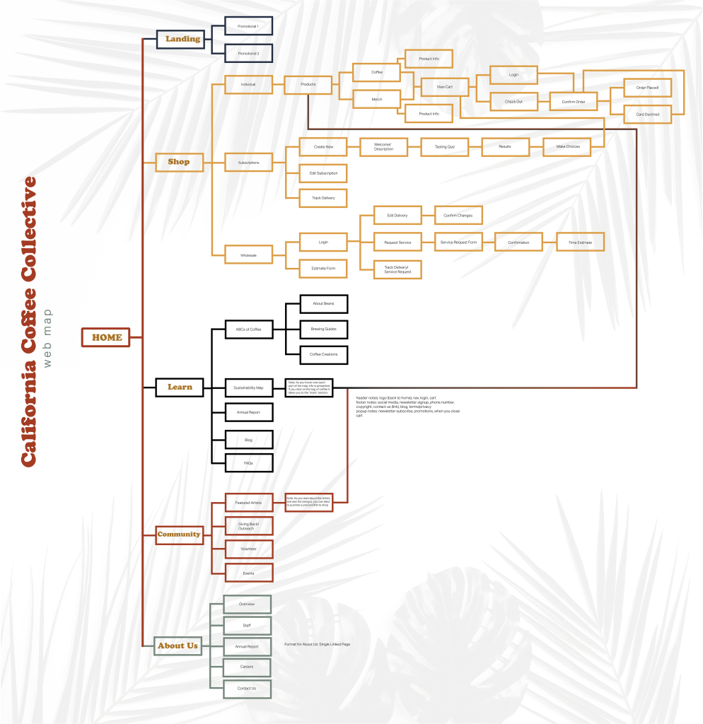
Once I have a decent idea of what this site needs and the priorities figured out, I start developing a more firmed up web map. This is when I typically jump into Adobe Illustrator of XD and start really laying things out. A web map needs to show every page a site needs to have. I really love to think of a web map as a living document that I can keep editing as I work on the site and as the clients needs change. My end goal for this web map is to be able to hand it off to a web developer as they develop the site and to hand it off to the client so they are able to reference it in the future for any changes. Forever the designer, I love to add color and branding to this web map. It makes following paths more comfortable and keeps the brand present as we continue to design and develop.
The Plan: Sketches & Wireframes
Sketches
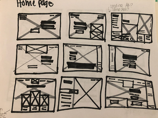
Now that I have a web map in order, I start sketching wireframes. I love using markers that can show grey scale values…this allows me to establish a bit of hierarchy and show background images. I like to wireframe the most important pages first. As I start wireframing I do a mini needs assessment for each page as well. Constantly I am reminding myself to keep the needs of the user and the goal of the design as a priority. Here are a few of my favorite low-fidelity wireframes for this site.
Wireframes
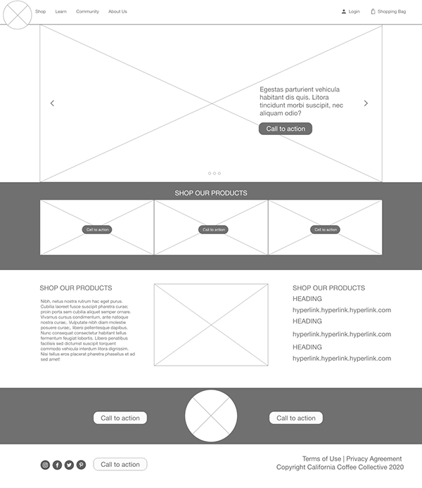
Once I have a great grasp of the layout and hierarchy for these sites, I once again go digital and hop into Adobe XD (or Invision) and start playing with pixels. I love using CC Libraries at this stage. I have a few libraries set up that contain UI elements that I can quickly grab. At this point, I also set up a library for this specific company and place any needed or recently created graphics into it for easy access. I’m currently still working on my mid-fidelity wireframes for this project, but I wanted to share a few with you. I try to do one per page and I love to actually plug everything in to prototype when I am done. This lets me check for any gaps in my logic and flow.
Final Design
Want Dote to Help You With Something Like This?
Let’s set up a chat and get started on your target audience assessment, brand strategy, brand/re-brand, and web project!
